At home: guest/kids bath design plan & inspiration
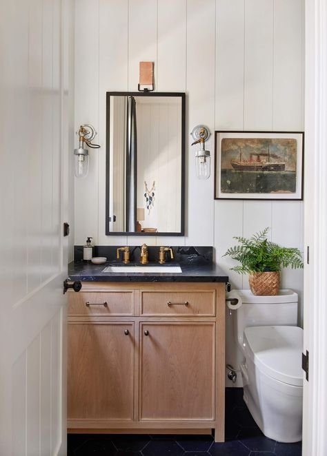
Photo credit: Amber Lewis Interiors
There have been many moving parts to navigate while living through our renovation.
Before we left for our Tahoe trip, we had to move the kids out of their bedroom and into the spare room to prepare for demo work. We also had to say goodbye to our only working bathroom.
The plan was for the team to get the new bathroom up and running (or at the least the new powder) and frame the kids room. As is common in renovations, they ran into some unforeseen issues and upon our return, the kids room was basically down to studs and without a floor (but hey, it was going to get replaced anyways).
We also ran into our first ut-oh moment in design. We had opted to go with a Neolith slab for the shower but it just didn’t pan out. So, we’re starting over and going back to tile. A tile I do love! It just hurts a bit more ($). And due to the changes, we’re currently without a shower. At least inside. The adventure continues!
Challenges like this are pretty common in home projects. One thing we continue to keep in mind is we want to get it right - we want to love it. And when you see something that you don’t like go in after all the hard work it took to get there, you know you have to take action. Better to do it while in the process!
The design of this bathroom was meant to be a continuation of our classic with modern touches theme. Our old bathroom (one we’ve all been sharing!) had old, small blue tile, a dated tub/shower and pedestal sink. In our new plan, we opted to move the bathroom to the other side of the hall because the new stairs going in impact the size of the kids room pretty significantly.
The new location was carved out of an old linen closet in a room that has an additional closet so it worked out well. A pocket door will bridge the bath and spare room, while another door keeps the bath accessible from the hallway.
Architectural elements
The biggest challenge we faced with moving the bathroom was the existing window. The window is on the front facade of the house which we worked hard to maintain. Since it’s located in the shower, it technically should be a sealed window - meaning the grids would be contained within the window panes (whereas all the other windows have grid on the exterior of the panes). It would have been pretty noticeable so instead we discussed with our team a plan to seal the window and use special paint, etc. Luckily, it sits just above the bench in the shower so shouldn’t get direct contact.
Design elements
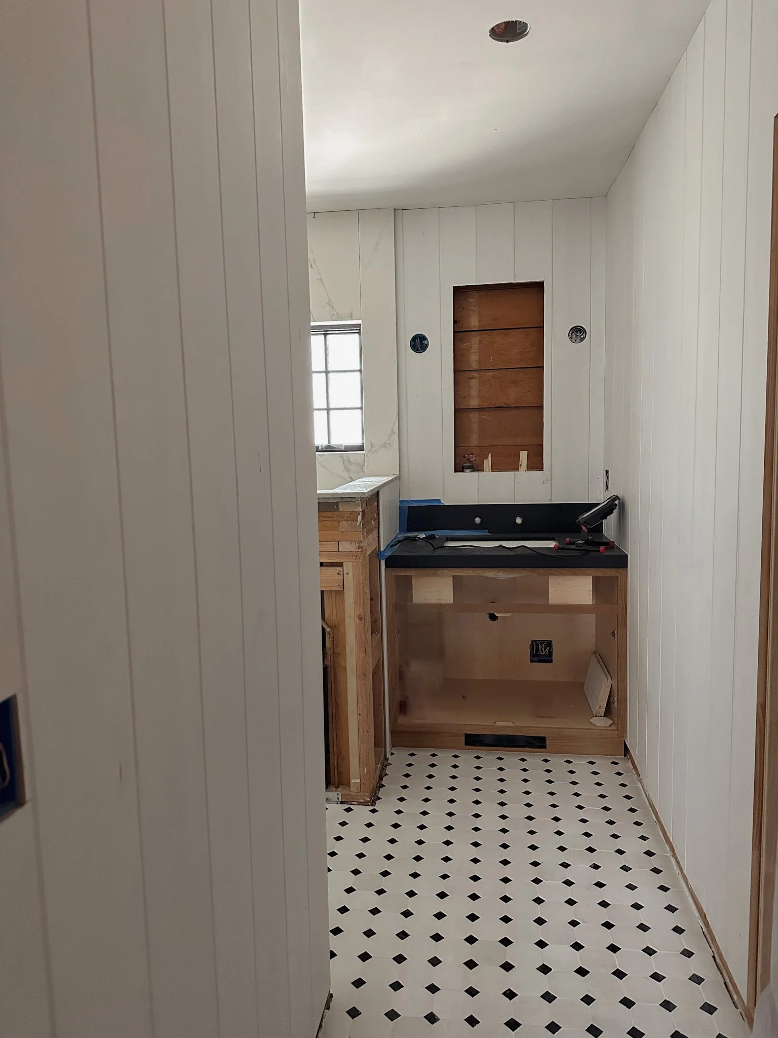
We wanted a lot of character while keeping our neutral palette. Other than the Neolith, I’m pleased with how it’s been turning out. The T&G is adding so much dimension and compliments the hand-made tiles we selected well.
The bathroom will have a decent sized shower that will carry the T&G look on the outside walls. We chose a white Zellige-like tile for both the pan and shower (just in different shapes). The walls will be 4in square.
Much of our inspiration came from one of my favorites, Amber Lewis. Her designs bring that casual-chic, California vibe.
In keeping this look, we opted to go with a natural, walnut finish for the vanity and reused the Absolute Black material from our powder room. It’s always good to make use of extra slabs and material where possible.
The finishes in this space are some of my favorites. We salvaged a beautiful Waterworks wall-mount faucet. And I love our sconces. Our design team helped to source the lighting and at a great price point! The mix of metals brings a little bit of an eclectic vibe to this space.
I’m happy with the balance of pretty details while keeping a masculine/neutral feel in this bath. Now here’s to hoping we get a working indoor shower soon! Here are some progress shots thus far.


